An Argument for the Vexillological Completeness of Texas Cities
If you like reading to music here are two song suggestions to pair with this post: with lyrics: Djesse, by Jacob Collier, Without Lyrics: Sonate pour violoncelle et piano No. 1 en Mi Mineur, Op. 38: I. Allegro non troppo, by Johannes Brahms
Note: A municipality is a legal governing entity associated with a city, but I will use the terms ‘city’, ‘town’, and ‘municipality’ interchangeably throughout this post.
Symbols are important, in that they represent us and our values. Texas is an outstanding place, with issues, yes, but also a land and people with aspirations and much to celebrate. I don’t think the current flags of major Texas cities do their jobs as symbols: conveying the complexity of their communities or the state. This blog post shares my idea to redesign the flags of a select group of Texas municipalities so that their flags would better represent their cities, the state, and its citizens’ shared identity.
Good flag design:
For most Americans, it comes as a surprise that most cities in this country even have a flag. This lack of knowledge of local symbols is understandable though, as explained in Roman Mars’s popular 2015 TED talk on how when a flag is poorly designed, it is often not flown, and therefore obscure to the public. Most American city flags are poorly designed, and obscure, like the flag of Cambridge, Massachusetts:
I am not just slandering this flag solely because I find the flag ugly, which I do; rather, I am singling out Cambridge because its flag transgresses literally all of the five simple guidelines laid out by the North American Vexillological Association (NAVA) a group of flag researchers and experienced designers, on how to design a good flag. I list the NAVA guidelines here, and explain how Cambridge’s breaks them to elaborate on their meanings:
Keep it simple: the Cambridge flag is packed with small details, which are hard to reproduce by everyday citizens, let alone remember, and are unclear when viewed flapping in the wind.
Use Meaningful Symbolism: The flag should say something about the place it flies over, and mean something to the people it represents; I wouldn’t be surprised if your average Cambridge resident had no idea what the building in the flag even is, but I guess the pretentious overindulgence in Latin could be interpreted as representing the vibrant classics professor community of this collegiate town, but as I will explain, the use of language, dead or alive, is still a vexillological misstep.
Use 2-3 Basic Colors: A flag should be a flag, not a locality-inspired study of Van Gogh’s inventive use of hue. Yet again, a flag should be simple, in part so that it can be easily reproduced and recognized; although it contains two highly prestigious institutions of higher learning, I would bet that the vast majority of Cantabrigians could faithfully reproduce a Starry Night, or even name another Van Gogh.
No words: A flag is a symbol, and the point of symbols is to convey an idea or emotion without the use of language. In some sense putting words on a flag makes it less of a flag, and more of a banner.
Be distinctive or be related: for the most part, a flag should be largely different from other flags. This aids with recognizability, but also every place is unique and deserves a flag that represents the location’s individual history, people, etc. If your flag is similar to others, you better have a compelling reason. Imperial British Dominions’ Flags all feature a union jack in the upper left corner, an area of a banner called the canton in flagspeak. This commonality is symbolic of the unity these places had/have in being ruled by the same colonial power. Similarity should be purposeful, creating unity, and/or room for individual expression; for example, the common format of said colonial British flags created a framework that allowed dominions to display some local identity through specific symbols in designated areas of the flag, without overwhelming officials with the task of designing an entire flag from scratch for every little island(1). Cambridge’s flag is similar to an innumerable number of American State and Municipal flags which follow the ‘Seal on a Bedsheet’ or SoB model, in which a seal made for official documents is blown up, and placed on several square feet of monotone cloth, collectively masquerading as a real flag. This similarity though is not symbolic of any unifying commonality of said places, other than using the imperial system instead of metric, and having bad flags. This makes Cambridge’s flag even more unrecognizable, as from a distance it looks like many other wasted civic design opportunities in America.
The current state of Texas municipal flags:
Out of the 10 largest cities in Texas, only two currently have flags that meet all of the previously mentioned 5 points created by NAVA. Some of these flags are hopefully close, but others unfortunately are ‘SoB’ stories.
My proposal:
Texas is unique among states. Its size, history, and culture have provided its people, for better or for worse, with a sense of state pride and identity that is closer to that common among countries, rather than subnational divisions (I will concede that California also has a similar state identification situation). In addition to this strong, unifying Texan identity, there is also significant diversity in geography, people, and culture, but also in wealth, opportunity, and attention. From the swamps of Houston to the arid mountains of El Paso, from the Tejano roots of San Antonio to the deep southern culture of Tyler, and from the over-hyping and wealth of Austin, to the poverty and need in Brownsville, Texas has a lot of beautiful diversity to be celebrated, and simultaneously many inequalities that need to be addressed. As a State, I believe that we should capitalize on the differences that make the state exciting both for us and outsiders while uniting under the strong Texas identity from which we all benefit to bridge the gaps in attention and wealth in our State.
For all the reasons aforementioned I propose a vexillologically complete set of flags for a select group of major Texas cities. What do I mean by vexillologically complete? Well, I propose the flags fit a template that allows for unique expression for each locale while creating a visual system as a whole that is greater than the sum of the individual flags. Simply, there should be a common theme in the flags that transcends individual representation. The theme I propose is the geographic location in the state of Texas. By referencing where a place, and therefore a viewer is within the wider state, I hope that viewers, visitors, and locals alike, think about a specific place in relation to others, creating a sense of interconnectedness, an invitation to explore other cities, hopefully enriching the local economy through tourism-related spending, or through investment in a community a company would not have considered otherwise, and a better appreciation of the greater whole, the state of Texas.
The flag of the state of Texas:
Design limitations:
I decided that the commonalities I would implement for the flags I would design should come from the Texas flag, as Texas is the overarching entity for all of these cities. The first overarching design choice I made was to restrict myself to the same color palette, the specific shades of red white, and blue found on the Texas flag. For the second common design element, I chose to include the ‘lone star’ in the same color (white), and around the same size (the size it is on the Texas flag), in every flag; ironically this lonely star represents Texans' unity, so I thought it would be a fitting commonality. I decided that the star's position would vary on each flag, roughly corresponding to the cities’ geographical location in the state. This I believe will create a unique sensation when viewed in its home area: a sense of place in this vast space (the massive state of Texas), making them excited to see what other areas of the flag, and the state, they can explore. Finally, if a city’s current flag had redeemable elements, I tried to preserve them. I only used symbols with meanings specific to the area.
How I chose the cities:
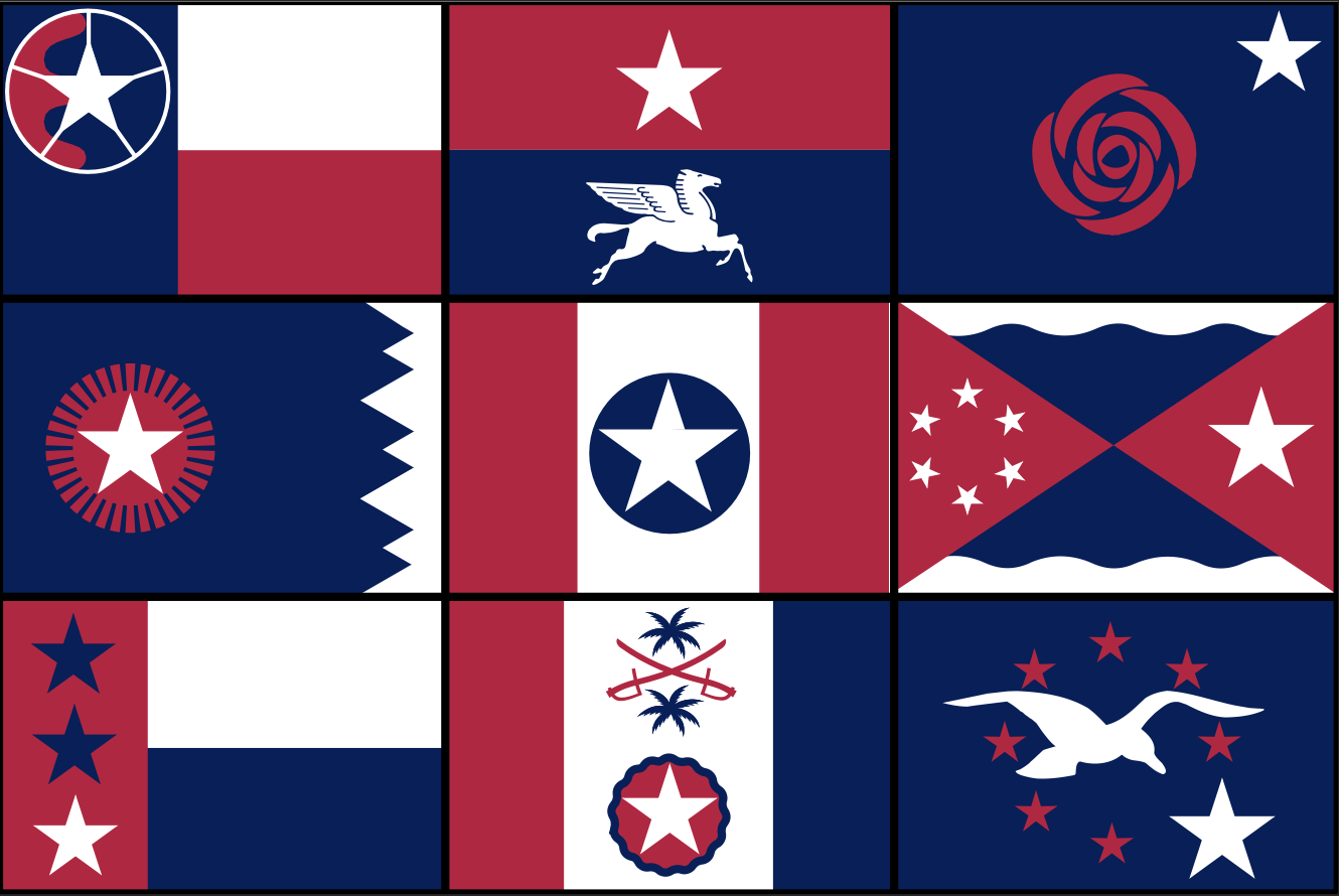
The state of Texas has 1,221 municipalities; obviously, I did not redesign all of their flags. Following the directional theme I sought to implement, I decided to choose nine, one for each of the cardinal directions, ordinal directions (like South-West), and the center of a compass rose. Roughly adhering to the list of largest Texas municipalities, I chose cities that are large, culturally significant, and not suburbs of other cities (sorry Houston and DFW mega suburbs like Plano). Although not suburbs, I also had to exclude several significant cities for varying reasons, FortWorth for its proximity to Dallas, an obvious representative of the North, San Antonio for not being South Enough (and so I could address Brownsville’s urgent flag situation- these Reddit comments agree with me on how bad it is), and Amarillo Abilene and Midland-Odessa for being in the same general direction as their larger counterpart in the North-West; Lubbock.
Chosen Cities and Their Corresponding Directions:
Key:
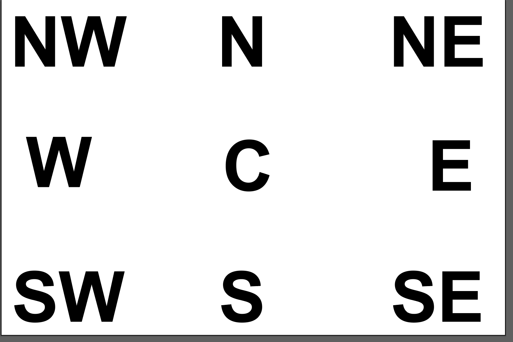
The blue lettering represents their direction, and therefore the relative location of the lone star on their flag, with C being short for the center.
Approximate Position of Stars according to the location of each city in the state:
Result:
After an ungodly number of hours, I have successfully redesigned the flags of the nine chosen cities, and put them into a collage to highlight the star-location effect:
Break Down of Each Flag:
Here I provide an image of each city’s original and redesigned flags, details on my design, and the symbolism of each flag.
Lubbock:
Original:
Redesign:
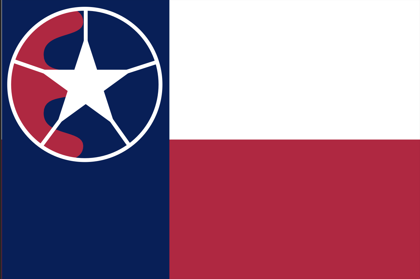
Lubbock, a college town on the prairie, is known for being the home of Buddy Holly and Texas Tech University. As found in the original flag, Lubbock prides itself on being a center for commerce and culture in the region, being at the intersection of 5 major state highways, giving it the nickname ‘Hub City’. I decided to keep the stylized representation of these 5 highways found in the original design with five white lines radiating from the lone star; by encapsulating this star-line amalgam in a white circle, I aimed to give the composition a wagon wheel-esque appearance, a somewhat cheesy homage to the western cowboy culture of the area, while doubling down on the Hub City identity, as it positions the lone star representing Lubbocks location at the hub of the wheel. In the background you can also see a form derived from the Comanche Nation Seal, following the fact that modern-day Lubbock is located right in the heart of the Comanche’s former range, called the Comanchería.
Dallas:
Original:
Redesign:
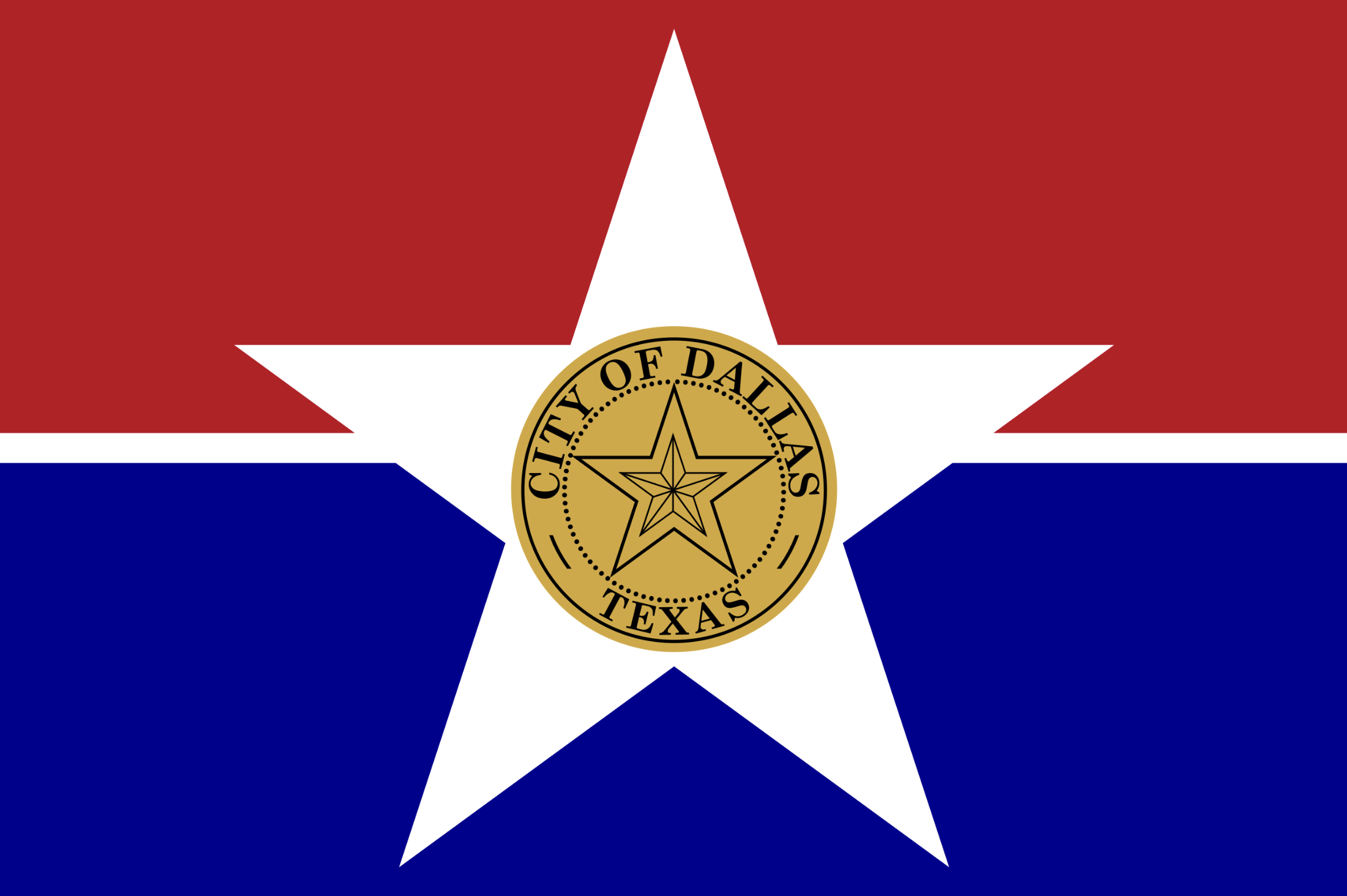
I decided to keep the bi-color background from the original flag, having a natural space for the star at the top representing Dallas’ northern location, and a symbol unique to the city below. And yes, if you were wondering, the particular pegasus I used was the former logo of Mobil, the petroleum corporation. And while I don’t agree with said company’s decision to prioritize profit over the well-being of our planet, it would not be fair to rob Dallas of such a dope mascot. For background, a large pegasus was originally placed on top of the Magnolia Oil Company in 1934. This company was then acquired by Mobil in the 50s who appropriated the symbol. Even after Mobil left the building in the 80s, the Pegasus symbol remained soaring over the city until 2000, when it had to be replaced due to wear and tear. The pegasus has come to represent the miraculous oddity of Dallas, a nowhere in the middle of the plains that has become a symbol of wealth, power, and progress.
Tyler:
Original:
Redesign:
Tyler is the biggest city in Texas’ rural, and culturally southern North-East. While this city’s region is traditionally associated with pine trees, peach cobbler, and the Bible, the city of Tyler has the unique reputation of being the rose production capital of the U.S. Because the current flag is a pretty horrendous example of the ‘Seal on a Bedsheet’ trend (in this case it's really more of a logo on a bedsheet), there is already a movement based around a proposed flag design that prominently features a stylized rose. I decided that it would be best not to reinvent the wheel here, and just propose something similar to what people already want. I borrowed the rose from the existing ‘New Flag for Tyler Project’ proposed design. I added the lone star in the northeast corner of the flag to correspond with Tyler’s location on the map.
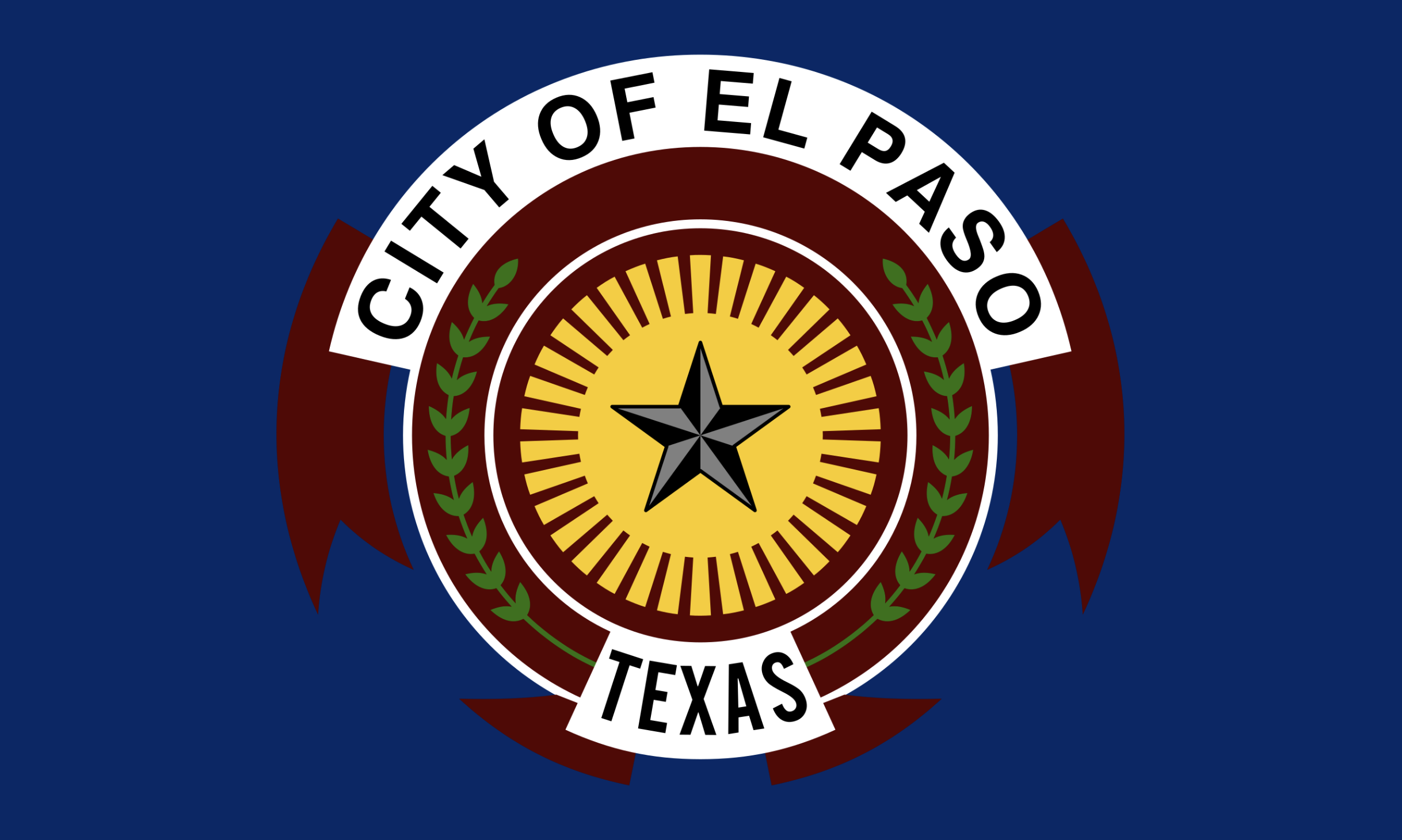
El Paso:
Original:
Redesign:
El Paso is closer to San Diego California than the other side of Texas; that fact is not relevant to my flag design, but it was illustrative enough of the enormity of Texas to share anyway. The only element I kept from the original design was the stylized sun. This is meant to represent El Paso’s status as the ‘Sun City’, a name earned by enjoying over 300 days of sunshine a year. The only design element I added was the geometric mountains on the right side of the flag. These are meant to represent the Guadalupe range, which dominates the El Paso landscape, but also, through three groupings of double peaks, the three Native American tribes indigenous to the area, and the close familial, economic, and cultural relationship between the two nationalities on either side of the border El Paso sits on.
Austin:
Original:
Redesign:
Austin, my hometown, you can do better than a SoB. Similarly to how Amsterdam blew up the escutcheon(2) of their city coat of arms to create a fantastic flag, I utilized the vertical tri-color design of the seal found on the original flag as the structure for my design. At first attempted to also include the lamp, which represents the knowledge culture of the city, in my new flag, but I couldn’t fit it in aesthetically, so I left it out for simplicity. While the blue circle can be taken to represent the many lakes and creeks of the city, it is more so there so I could place a white star in the middle of a white background, to keep the lone star symbol consistent across the flags.
Houston:
Original:
Redesign:
I decided not to include anything from the original flag, as none of the symbolism is particularly meaningful. I also knew at the outset that there were several aspects to the city which I wanted to reference in the flag: the bayous, the historic six wards, and progress/moving towards the future. I found it pretty difficult to include all of these priors in one flag; I went through five different designs but finally landed on the design pictured above. The base layer is a blue band, representing the bayous of Houston, which are historically and culturally significant to the city. The wavy borders represent the complex relationship between the city and its waterways, which are crucial parts of the city's stormwater drainage system, but also flood surrounding areas when overwhelmed. The red triangles are a stylized hourglass, an object found on Sam Houston’s, the city’s namesake, coat of arms; this symbol reflects Houston's fast march to the future, with the city changing rapidly from year to year, and looking to be a major home for the increasingly important commercial space industry. Finally, the six stars on the left represent the six historic wards of Houston. Their arrangement into a circle references the three beltways that dominate the city’s sprawling urban form. Finally, the lone star on the right symbolizes unity in the city.
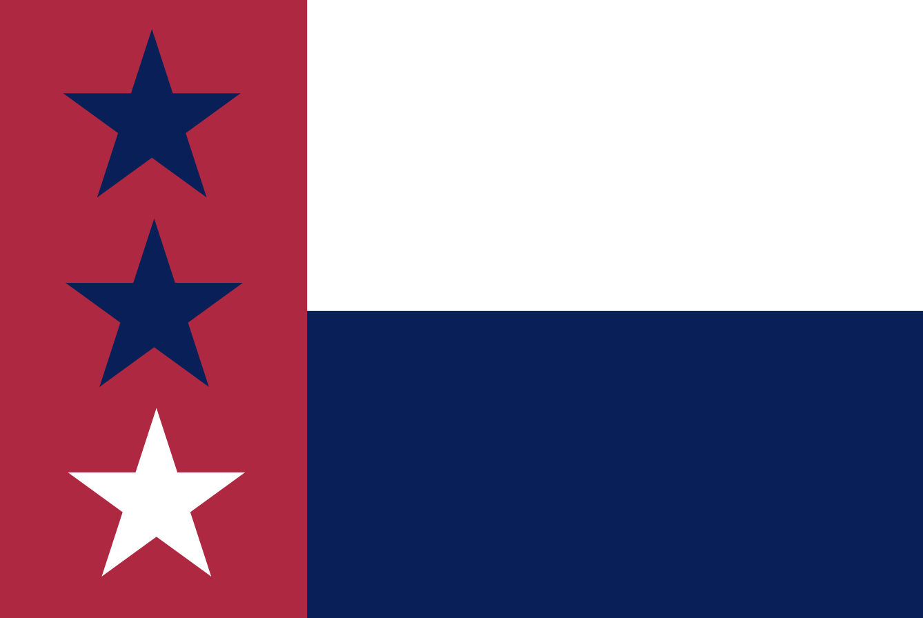
Laredo:
Original:
Redesign:
Laredo’s current flag is pretty awesome. It is derived from the flag of the Republic of the Rio Grande, a short-lived movement in what is now Southern Texas, that fought to gain independence from Mexico around the time of the Texas Revolution. Not wishing to change much, I simply made changes to fit the current flag to my template; I switched some colors and changed the two top stars to blue, so it is clear that the bottom star denotes the direction.
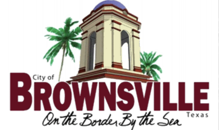
Brownsville:
Original:
Redesign:
I was originally planning on having San Antonio represent South, but SA is pretty close to Austin, plus I felt it would be immoral to not raise awareness of the monstrosity that is Brownsville’s current flag, so I included the city in my set. I wanted to challenge myself by including something from the old flag. I originally planned to include a stylized version of the bell tower found in the old flag but scrapped the idea for another. Focusing on the city’s motto of ‘On the Border by the Sea’, I decided to structure the flag around references to the city’s surroundings. Starting on the Far left, I included a red bar, representing the shared Latino heritage that transcends Texas’ border with Mexico; The white represents the nearby beaches of South Padre Island, and the blue represents the Gulf of Mexico. In the Middle, I surrounded the lone star, representing Brownsville’s location in South Texas, with a wavy line, a reference to the meandering path the Rio Grande River takes along this section of the border. On top of the star, I placed two swords to symbolize the two wars which had major battles in Brownsville. To add visual weight to the top of the flag, I also incorporated two palm trees, common in Brownsville’s sub-tropical climate, to symbolize the two nations of the Border.
Corpus Christi:
Original:
Redesign:
Like Laredo, Galveston already has an excellent flag. I chose not to deviate far from the original design. I changed the colors to fit the template and resized the star in the South East corner to represent Corpus Christi’s location and to be the same size as the lone star on the Texas flag. I also replaced the seagull with one that could fit further up and to the left in the circle of stars, balancing the enlargement of the lone star in the bottom right.
I recognize that local peoples probably did not get a say in designing their new imperial flag, or even in more important matters, and that most places ruled by the British Empire were not super jazzed about being part of this ‘united whole’, but this blog post is not here to educate you on the evils of imperialism, let alone the British Empire specifically. If you are interested in learning more about the subject, I suggest you check out Caroline Elkins' work.
This is the shield part of a coat of arms in European heraldry.


